Coords

Happy Park Carnival OP - Navy
Here we have a polyester one-piece with a bold medium blue background. Paired with a red bag and red shoes, we have a 3-color coord consisting of blue with red and white accents. A few other ancillary colors such as yellows and browns add some variety into the composition. I wore this dress for Fourth of July and it was a big hit.

Fresh Strawberry Diner OP - White
Fresh Strawberry Diner is one of my absolute favorite dresses! The white colorway paired with white knee-high stockings and red heels is the epitome of cute. In this coord, we actually have a somewhat unique harmony. In the dress, we can see some greens and some pinks, but the eye largely perceives this as a two-color harmony of white as the root note and red as the major third. I view the greens and the pinks as ancillary colors, like melody notes on top of a core harmony. This is one instance where I think white shoes would work, but personally I like to have a high shoe-to-stocking contrast, which really draws a lot of emphasis on the shoes. In this case, that red really pops and makes the outfit really come together.
Sweet Cookie Box OP - Pink
Sweet Cookie Box is a newly acquired dress for me. Kind of a thin material, it's not my favorite but I do like the print. In this coord we have the choice of blue shoes, which grabs the blues from the dress. Brown shoes could also have looked nice with all the browns from the cookies in the print.
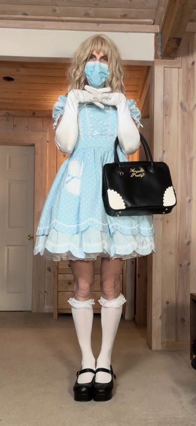
Bunny Chan OP - Sax
Here we have a solid three-color coord consisting of sax with black and white accents. The blacks add a bit of sophistication to an otherwise childish-like coord. As a general rule, I match my shoes with my bag. But not always, as you can see in my black Bunny Chan coord (pictured below).

Dreamy Baby Room JSK - Pink
Here we have the Dreamy Baby Room JSK paired with a short-sleeve blouse in a two-color coord of pink and white with ancillary colors such as blues and yellows for variety. An absolutely perfect dress, featuring corsetry in the back and made of pure cotton, it is the epitome of what a sweet lolita dress should be.
Bunny Chan OP - Red
Probably my most-worn dress, the Bunny Chan OP in red, which looks absolutely amazing with that bright red color and tasteful polka dots. At first I didn't like the bunnies on the front but now I appreciate the rather simple composition. With a matching polka dot face mask, you have a cohesive polka dot pattern throughout the coord. Sometimes I pair this with red shoes and a red bag for a two-color coord.

Milky Planet OP - Yellow
Here, a nice yellow OP paired with pink shoes and a white cross-body bag for a predominantly yellow coord with two accent colors of pink and white. I almost always wear white stockings in all of my coords so white always shows up as a color in the composition. I could have also paired this dress with yellow shoes. However, I find that the pink shoes balance out the pinks in the dress for an overall balanced presentation.
Bunny Chan OP - Black
Here we have an interesting choice of a two-color coord with an intentional disruption color of red chosen only for the bag. The obvious choice for the bag would have been either black or white. The choice of red, which is already a very eye-catching color, really stands out and provides a lot of visual weight to the composition.
Fancy Candy OP - Black
This OP is a great Halloween print. It is a back zip, and one of the more challenging dresses to fit into for me. In this outfit we have a three-color coord black, white and predominantly pink accents. Some ancillary teals and purples create a really interesting color combination with lots of high contrast. I really like the high contrast of black heels with white stockings. However, with lots of colors showing up in the print, you could even pair the dress with mint or sax shoes and so lots of coords are possible with this print.
Dream Baby Room JSK - Yellow
Here we have a fairly simple coord consisting of a yellow JSK paired with yellow flats. The pink in the face mask is helping to balance out the pinks in the dress, but a more conservate approach would have been to use a yellow mask. In my own critique, a pink bag might have helped balance out the pink with the face mask. With so many colors in the print, it would look nice to have some pinks and blues in the stockings to add more visual interest.

Sugary Carnival OP - Pink
Every lolita wardrobe needs one pink Sugary Carnival dress. I mean, this is what I would call an absolutely perfect dress. Yes, it's really popular, but for good reason. In my opinion it's the best dress Angelic Pretty ever released. Let's run down the list: pure cotton, back corsetry, side zip, bright colors, perfect cut. Then you have the leading lines of the carousel running up and down the dress with ponies on the bottom. I have it in black as well. If you were to get one lolita dress, it would have to be Sugary Carnival (in pink). Here in the coord I have all pink except for my bag and gloves. It's just a great dress and I always get lots of people coming up to me asking about it whenever I wear it out. So I would have to say it is indeed my favorite dress.
Bunny Chan OP - Pink
Bunny Chan is actually a dress that I wear more than Sugary Carnival and it's probably my second favorite dress. It looks a little bit more like a normal dress since it doesn't have any cute characters on it. What I like about it most of all is the cut, which fits me perfectly, and I mean perfectly. Therefore, I eventually tracked down the other colorways and Bunny Chan is the only dress where I have all of the colorways. The pink colorway is actually unique, though, because unlike the other colorways that have white elements, the pink colorway is pure pink 100% of the way through except for the polka dots. I actually really like this choice and it helps create an ultra cute, ultra girly presentation. I paired it with white gloves here but it could totally work to have pink gloves, essentially making it a one-color coord. The white bag adds some white into the mix.
Comic Toys JSK - Pink
Here we have Comic Toys in pink. I actually have this same JSK in sax, which I think is one of the rare instances where I like the sax colorway better than the pink, only because the details pop more on the sax. In this coord, we have an overload of pink, including a ribbon scarf and a blouse all in pink. A white bag serves as a disruption color, as there is no white on the print at all.
Decoration Ice Cream JSK - Pink
I wore this to coord to the 2025 Silicon Valley Pride Parade. Paried with a pink parasol, the outfit was a big hit with lots of people coming up to me and asking for pictures. This is what I would consider a two-color coord of pink and white with ancillary colors showing up in the print, which features an assortment of ice cream cones. It was a very hot day so the ice cream fit the vibe and the parasol provided much-needed shade.
Sugary Carnival JSK - Black
In this coord I have a three-color harmony consisting of black, white, and pink. The dress features two other ancillary colors - yellow and blue. I've chosen to wear the matching headbow here so those colors are included elsewhere in the coord. Here is another instance where I'm not matching my bag with my shoes. Since the dress is already black, a black bag would blend in, whereas a pink bag stands out and provides visual interest. Another rule I tend to follow is to make sure that my shoes are at least as dark as my main piece. For that reason I didn't wear pink shoes since the dress's black has a lot of heavy visual weight and that weight needs to be counterbalanced by black in the shoes.
On a side note, one reason I like this black colorway is that the print and all of the visual elements really pop and the leading lines are highly emphasized, giving the eye a lot of detail to dig into.
Candy Pop OP - Pink and Sax
Here we have a pink OP with sax accents. Candy Pop is another dress where I have multiple colorways. In this case, I've chosen blue shoes and included the matching choker, which comes in the set. The dress actually has white polka dots which are barely visible in this picture, making this a three-color harmony. See the next picture for the back of the dress, which is one of my favorites for several reasons.
Candy Pop OP - Pink and Sax
I feel like the back of a dress never gets shown enough in pictures, but it's such as big part of what makes a lolita dress unique! Here we have several elements that provide a lot of visual interest, including contrasting corset lacing and a contrasting backbow. I have included this picture so you can see a good example of what a nice and tidy backbow should look like. Learning to tie your own backbow is big step in your lolita journey, and is a milestone you should be proud of. when you finally learn it! In this example, you have this fishtail-type design, which is my absolute favorite backbow design because it is symmetrical and provides the eye with a high emphasis on the leading lines, which look and function like arrows, pointing to the center of the backbow, where the eye continues up the corset lacing. The blue borders throughout provide a sense of closure to the pattern, giving the composition a lot of definition. All these elements make this design by Angelic Pretty one of my all-time favorites.
Charming Cherry OP - Pink
Here we have a three-color harmony with pink, red, and white. Pink and red is a common color combination you will find in many lolita coords. In this instance, I've chosen a heavy emphasis on red with the choice of red shoes. The red provides a high amount of contrast with the white stockings. Additionally, the shade of pink in the dress is a deeper shade than most of my other accessories. Altogether, the ensemble is very eye-catching and you are sure to stand out in a crowd with such an outfit on. The whites in the bag provide a good counterbalance to the whites in the stockings and gloves.
Space Toys OP - Pink
Here we have a dress with a deep pink. This is a color I don't have many accessories in. There are some blues, yellows, and lavenders in the print. I think in this case, lavender or blue shoes would have looked best. The lighter pink for the shoes and bag was chosen simply out of necessity since I don't have a blue bag and I don't have lavender shoes. Even still, a varied shade of pink provides some variety to the composition.